Sunday, October 19, 2014
OTR- Buck Rodgers
For this assignment, I listened to "Buck Rodgers in the Twenty-fifth Century" (in the science fiction tab at otr.com) It was interesting to listen to a radio show like this because I don't think I've ever really listened to anything like this. Of course, we've read books and we've seen movies, but it was this in-between medium that was lost to my generation. First, writing for radio must have been very difficult. They had to create place, character, and even time, without any visual aids. I also thought it was interesting how advertisements were incorporated into these shows. Unlike today, where we have commercial breaks, Buck Rodgers had advertisements built in to the beginning and the end of the story. I thought it was especially funny how Wilma, the lab assistant, ends the show by suggesting they get a popsicle, leading straight into a detailed and obnoxious advertisement for fudgesicles. And finally, I think "Buck Rodgers" was an interesting listen especially because of how they make speculations about the future. Some things are so far fetched, its almost humorous that they think its possible, and some things they think will take 500 years and we've already achieved it
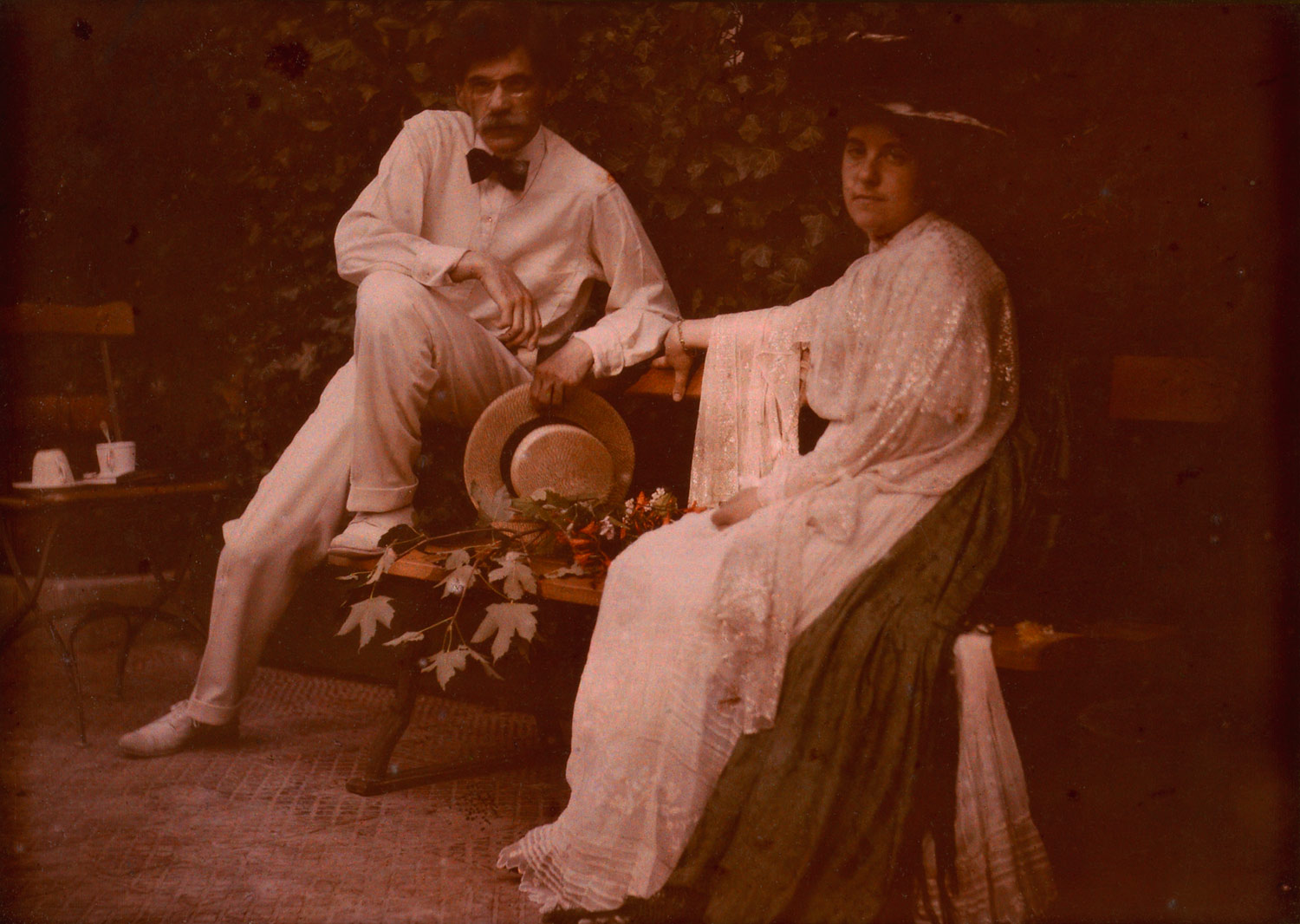
Vernacular Vs. Pictoral
Pictoral photography is artistic
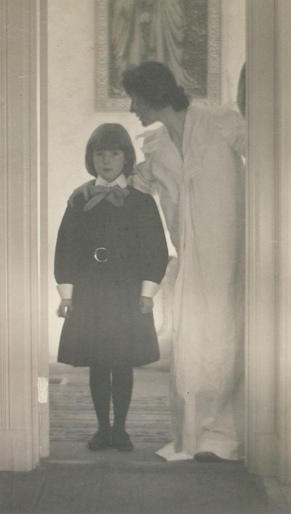
Blessed Art Thou among Women, 1899 Gertrude Kasebier
Stieglitz and Emmy, 1907 Frank Eugene
Dance Study, ca. 1912 Adolph de Meyer
(all photos from http://www.metmuseum.org/toah/hd/pict/hd_pict.htm#slideshow1)
Vernacular is anything BUT artistic:

Anonymous, “Man in Noose” (date unknown) from the collection of Marc Boone Fitzerman.

Anonymous, “Kids on Porch” (date unknown) from the collection of Marc Boone Fitzerman.

Anonymous, “Farm Gathering” (date unknown), from the collection of Marc Boone Fitzerman.
Blessed Art Thou among Women, 1899 Gertrude Kasebier
Stieglitz and Emmy, 1907 Frank Eugene
Dance Study, ca. 1912 Adolph de Meyer
(all photos from http://www.metmuseum.org/toah/hd/pict/hd_pict.htm#slideshow1)
Vernacular is anything BUT artistic:
Anonymous, “Man in Noose” (date unknown) from the collection of Marc Boone Fitzerman.
Anonymous, “Kids on Porch” (date unknown) from the collection of Marc Boone Fitzerman.
Anonymous, “Farm Gathering” (date unknown), from the collection of Marc Boone Fitzerman.
Abe Morrell
At first, I though the "camera obscura" was a primitive parlor trick that wasn't good for anything except lead us to the invention of photography, but Abelardo Morell has clearly proved me wrong. Morell has essentially perfected the camera obscura and used it to create organic artwork by melding projections of an exterior and projecting them onto a new surface. The softness and realistic feel of the projections couldn't be achieved by any technological means, giving it a very unique and intriguing quality. My two favorite pieces were "View of Roman Sculpture in Palazzo del Conservatori, 2010" and "The View of Central Park Looking North- Series, 2008"
View of Roman Sculpture in Palazzo del Conservatori, 2010

I like this piece for a couple reasons. First, I think it illustrates a connection between ancient society, technology, and artwork. It also demonstrates the quality and detail of Morrell's tent camera because of the projection of a living being onto the rustic pattern of the floor. The juxtaposition intrigues me.
The View of Central Park Looking North- Series, 2008


df This series was one of my favorite Morell piece because it captures all the emotion and nostalgia of this landscape and uses it to dress the room. This picture reminds me of a view from a window at a friend's house back in Minnesota. I remember the different feelings I got when I looked out the window. I felt kind of dry and depressed in the winter, and bright and happy in the summertime and I think it had something to do with the environment. This series puts that literally, because I can imagine standing in these rooms feeling those feelings again.
View of Roman Sculpture in Palazzo del Conservatori, 2010
I like this piece for a couple reasons. First, I think it illustrates a connection between ancient society, technology, and artwork. It also demonstrates the quality and detail of Morrell's tent camera because of the projection of a living being onto the rustic pattern of the floor. The juxtaposition intrigues me.
The View of Central Park Looking North- Series, 2008
df This series was one of my favorite Morell piece because it captures all the emotion and nostalgia of this landscape and uses it to dress the room. This picture reminds me of a view from a window at a friend's house back in Minnesota. I remember the different feelings I got when I looked out the window. I felt kind of dry and depressed in the winter, and bright and happy in the summertime and I think it had something to do with the environment. This series puts that literally, because I can imagine standing in these rooms feeling those feelings again.
Monday, October 6, 2014
Mark J. Stock
After my first look through Mark J. Stock's photos, I was a little disappointed because I didn't see much variation. Of course, the colors and the composition changed, but I found myself thinking they were all "just smoke and squiggly lines" (the J word being one I steer clear of when talking about art). However, the second time I looked through the work, I paid more attention to the descriptions and how they relate to the pieces. I began to see the genius in the work.


Wave for Hokusai
I like this piece for several reasons. First, I loved Katsushika Hokusai's "The Great Wave off Kanagawa." I recall a large print of it in my grandparents living room when I was growing up. I've always appreciated it because of its historical, cultural, and artistic significance but Stock's take on the famous painting exposed me to a new aspect. I had not previously considered "The Great Wave off Kanagawa" as a study of a science, "turbulence cascade."This added a whole new dimension to both this piece and the original. Where I initially saw "just smoke" there had all along existed something very particular and scientific.
Refinery #53
I also really liked this piece, not for any particularly intelligent reason, but because of how well it captures the artist's ability and intentions. First, it demonstrates a great deal of technological talent. It must have taken a lot of handwork and expertise to achieve its complexity, particularly with the lighting. And secondly, I think this piece does a wonderful job of capturing the artist's intended emotion, "despair and loneliness." Within this tangle of tubes, I see a vast and lonely world. It definitely gives off a feeling of depression.
Sunday, October 5, 2014
Gyorgy Ligeti
I'm actually very happy we were asked to blog about Gyorgy Ligeti. After my first 2001 a Space Odyssey experience, I checked out some of his work, particularly "Requiem," which was featured in the film. For this assignment, I chose to listen to another piece by him, "Lux Aeterna." It definitely has a lot of similarities to the 2001 score, as it easily identifies with Ligeti's unique experimental style. The word "ethereal" immediately comes to mind when I listen to one of his pieces. The words "Haunting" and "Dissonant" follow after. This is certainly so with "Lux Aeterna" as it features long complicated cords with dramatic dynamic changes, a combination that creates this otherworldly sound. In listening to this piece with high volume, I was made very aware of the descant soprano line which gives the piece a heavenly charm. Conversely, the low, droning bass notes give it a haunting feeling that reminds me of a gong or one of those Tibetan singing bowls. At times I could physically feel the sound waves reverberating in my head. Overall, I kind of liked this piece. I wouldn't necessarily rush to buy it on iTunes, but I think it works really well as a score for a film or perhaps meditation music.
Wednesday, October 1, 2014
Flip Book Assignment
Wow, this project really was a test of my patience and a very enlightening learning experience. When I first got the assignment, I immediately had a series of ideas I wanted to try out. This led to a few sketch sessions to develop easy to draw characters so that I could easily recreate it multiple times. Unfortunately, the majority of these concept characters were too complex or not very creative. I decided to just get a book from the store and start with some more intangible concepts. I went to a local thrift shop and picked out a book, "How to Survive the Loss of a Love" by Melba Colgrove PhD, Harold H Bloomfield MD, and Peter McWilliams. I chose this particular book because it had an Oprah sticker on it and it had plenty of white space on the pages.
On a rainy afternoon, I sat down and dedicated several hours to drawing. This led my idea to make the flip book about the creative process. The style and complexity develop as the pages flip. It was a chain reaction that grew artistically. I was also able to incorporate one of the characters I created, the nameless smiley fish. I liked the way its shape helps its animation. The simple curves and lines were easy to change subtly to create the illusion of movement.
Finally, I wanted to make a note about the color. It really was a last minute decision that ended up working pretty successfully. When I incorporated the zooms into the animation, I made the cake bit difficult to color because of its size changes and proximity issues. When the "lens" was too close to the cake, it was going to be difficult (and probably messy) to color the entire page. I then came up with the fading and appearing effect which I thought looked very coral when animated.
Overall, I'm pretty proud of the final product. I'm not very confident in my drawing abilities and I think I need to take a class or something to improve on it but I think the overall composition was successful as a short piece.
Subscribe to:
Posts (Atom)